Case study / Working draft
Garcia HandPicked
Client
Holistic Industries
Focus
Packaging, campaigns & retail
My role
Packaging adaptation, illustration & 3D visualization

01 / The brief
An established identity. A wider stage.
The original brand identity and packaging system were already in place. This work built on Garcia’s familiar colors, lettering, portraiture, and musical references, adapting them for new markets and formats. The aim was to preserve that recognizable character while addressing practical production, information, and retail needs.
02 / California packaging
Adapt the package. Preserve the voice.
Pre-roll tubes and flower jars were adapted for the California launch. The work refined dielines, information hierarchy, SKU distinctions, and state-specific labeling content, carrying the existing identity into packaging designed around the market’s production and retail needs.

Pre-roll tubes — packaging adaptation within the established brand system.
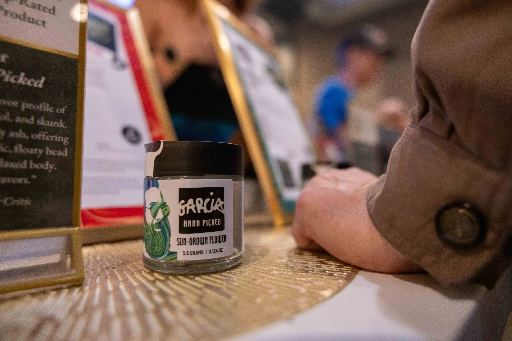
Flower jars — California packaging and product presentation.
03 / California launch creative
Give the familiar imagery a local setting.
The launch key art paired Jerry Garcia’s portrait and the brand’s established visual language with a San Francisco setting. A retail merchandising concept explored how that campaign could extend into a shared in-store environment with Solful.
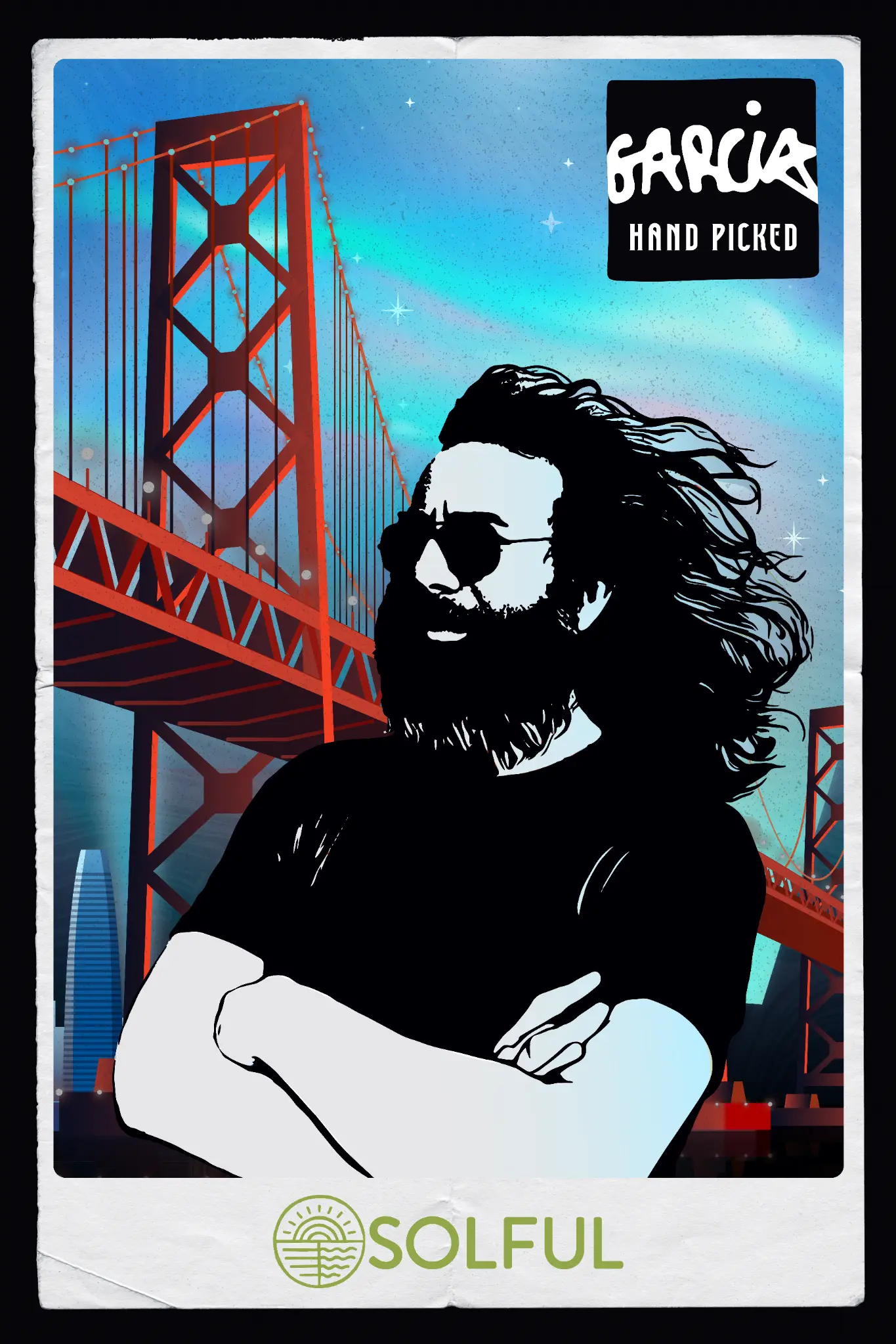
Launch key art — Garcia HandPicked and Solful in a San Francisco setting.
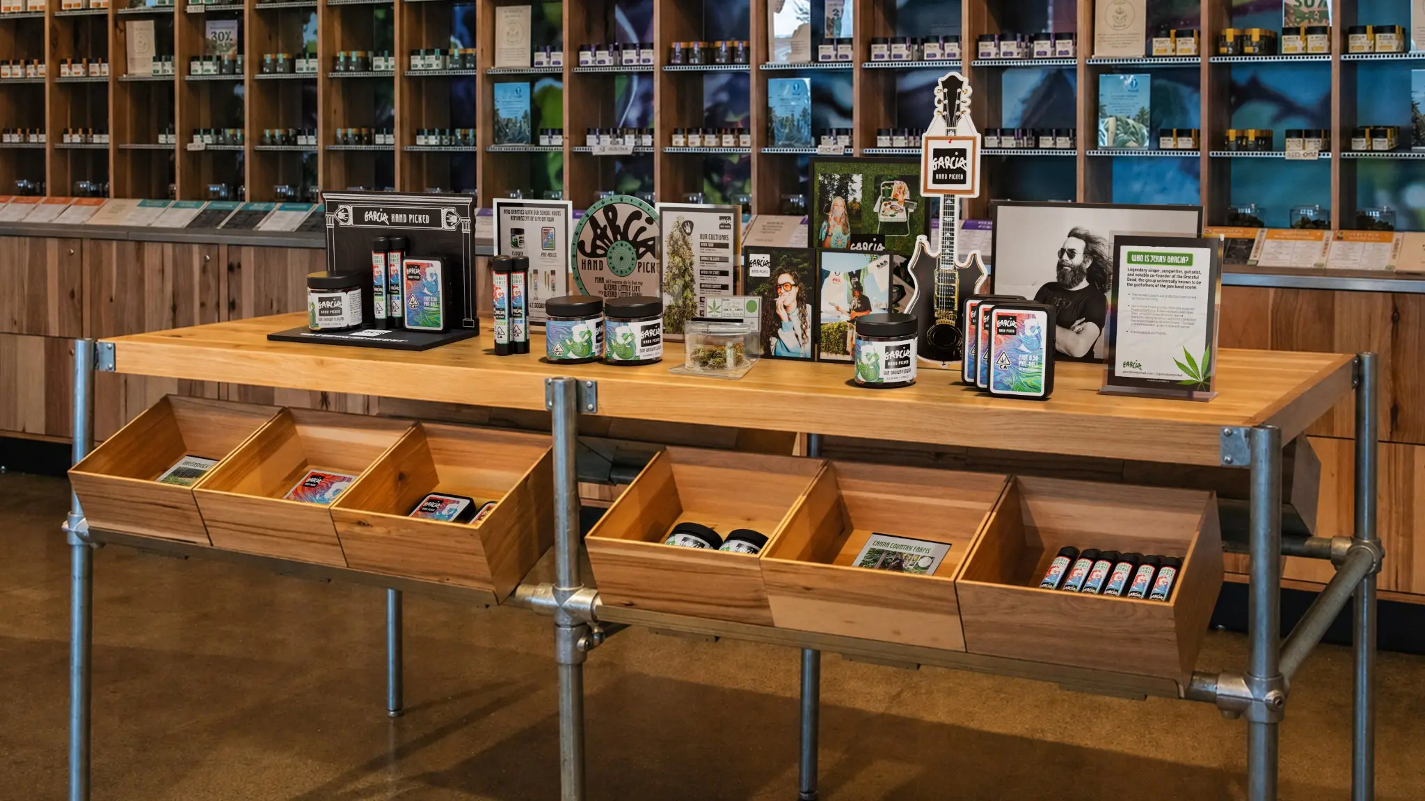
Retail merchandising concept — a proposed extension of the California launch creative.
04 / The Las Vegas event
A separate stage in Las Vegas.
Event-specific packaging and key art were created for an exclusive Garcia HandPicked event at Thrive Dispensary. The concept reimagined the Las Vegas skyline with the Sphere in the brand’s signature marbling, then carried that setting across pre-roll packaging and lounge graphics.
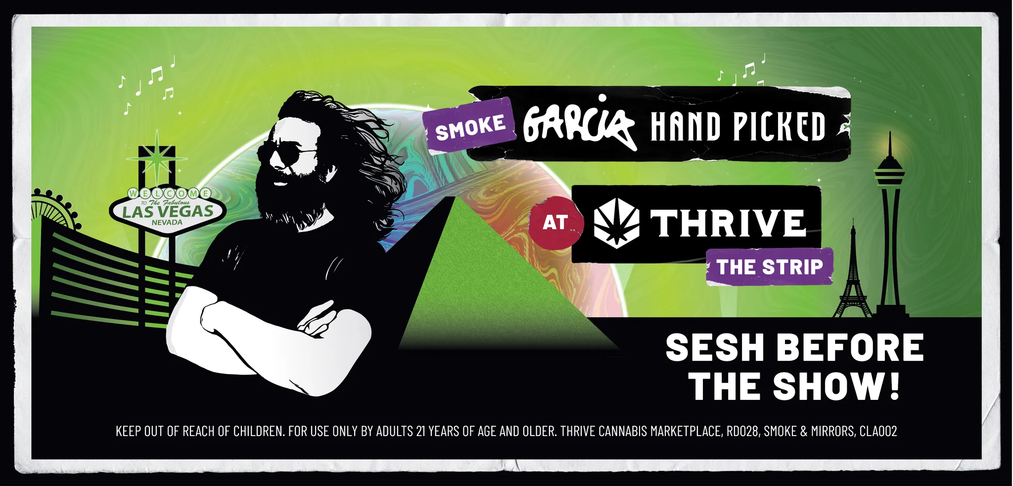
Thrive event key art — the Las Vegas setting interpreted through Garcia’s visual language.

Exclusive event packaging — the concept translated onto a pre-roll tube.
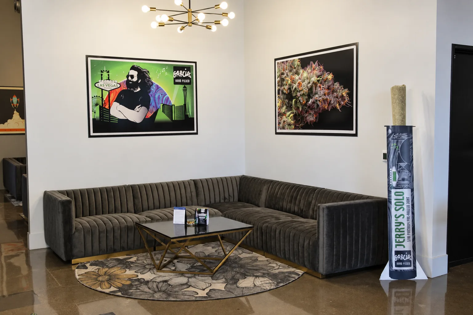
Lounge application — event artwork and product display shown together.
05 / Illustration & process
From drawn studies to a shared graphic world.
“Magic Is What We Do” combines expressive lettering, roses, botanical forms, and the Garcia handprint. Drawn studies developed into finished artwork and motion, then extended into apparel and retail graphics. The process and finished illustration sit alongside the applications below.
Watch the process — from drawn studies to the finished illustration.
Finished artwork in motion — “Magic Is What We Do.”
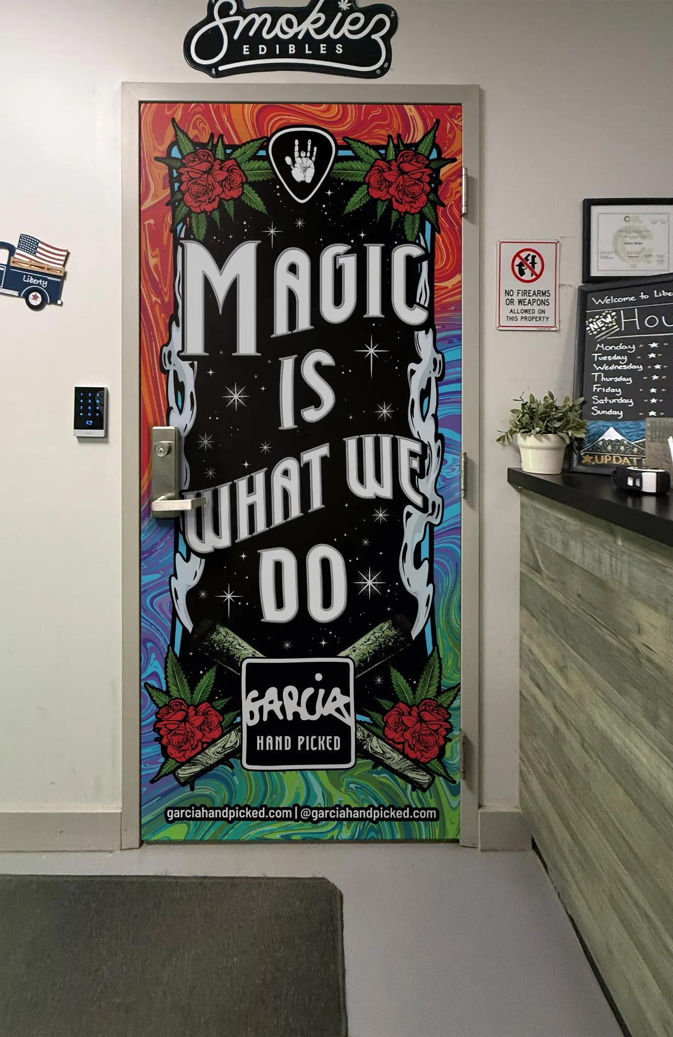
Retail application — the illustration wrapped onto a dispensary door.
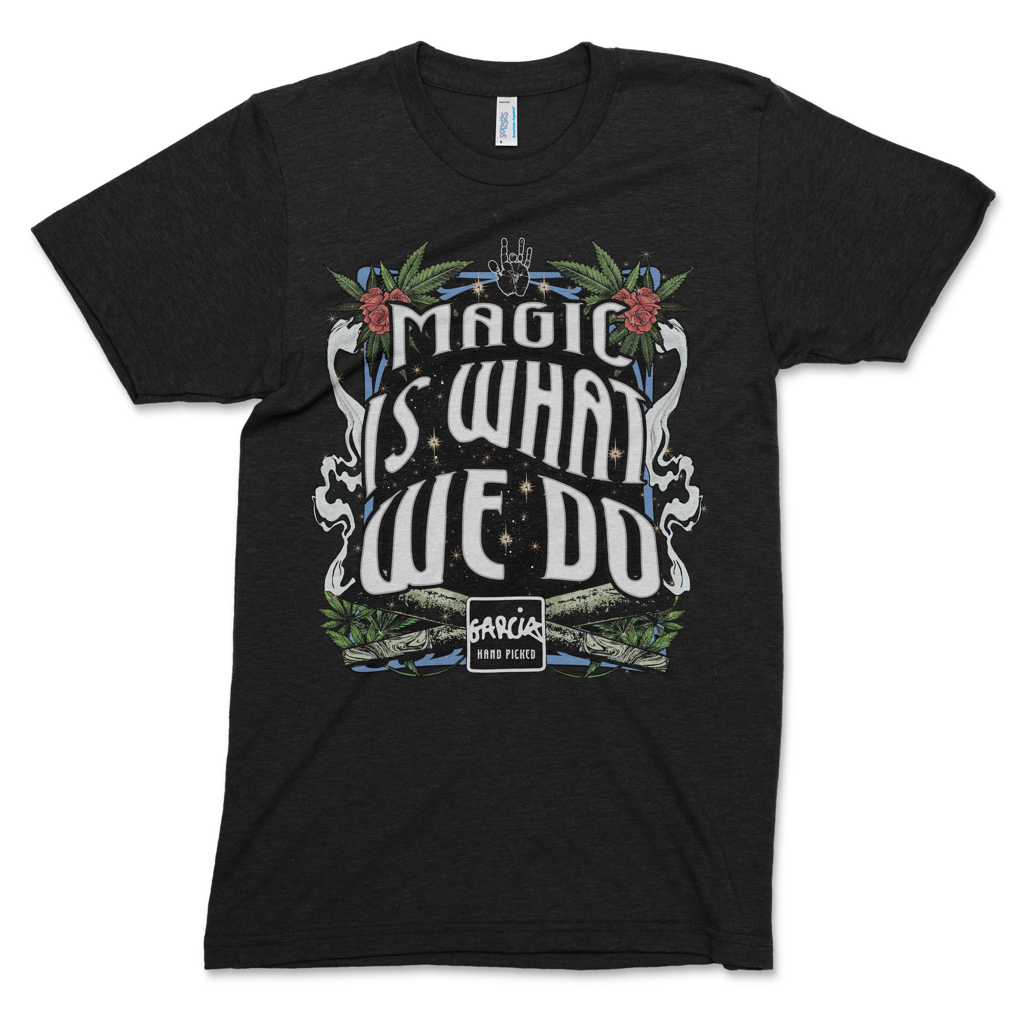
Apparel application — the artwork translated onto a Garcia T-shirt.
06 / Retail concepts & 3D
Explore the space before production.
Three-dimensional concepts explored product capacity, scale, sightlines, lighting, and brand hierarchy. Shelf variations tested different forms, while a wider Holistic retail wall placed Garcia within a multi-brand environment. These renders show the design exploration before production.

Retail wall concept — Garcia at the center of a multi-brand Holistic environment.
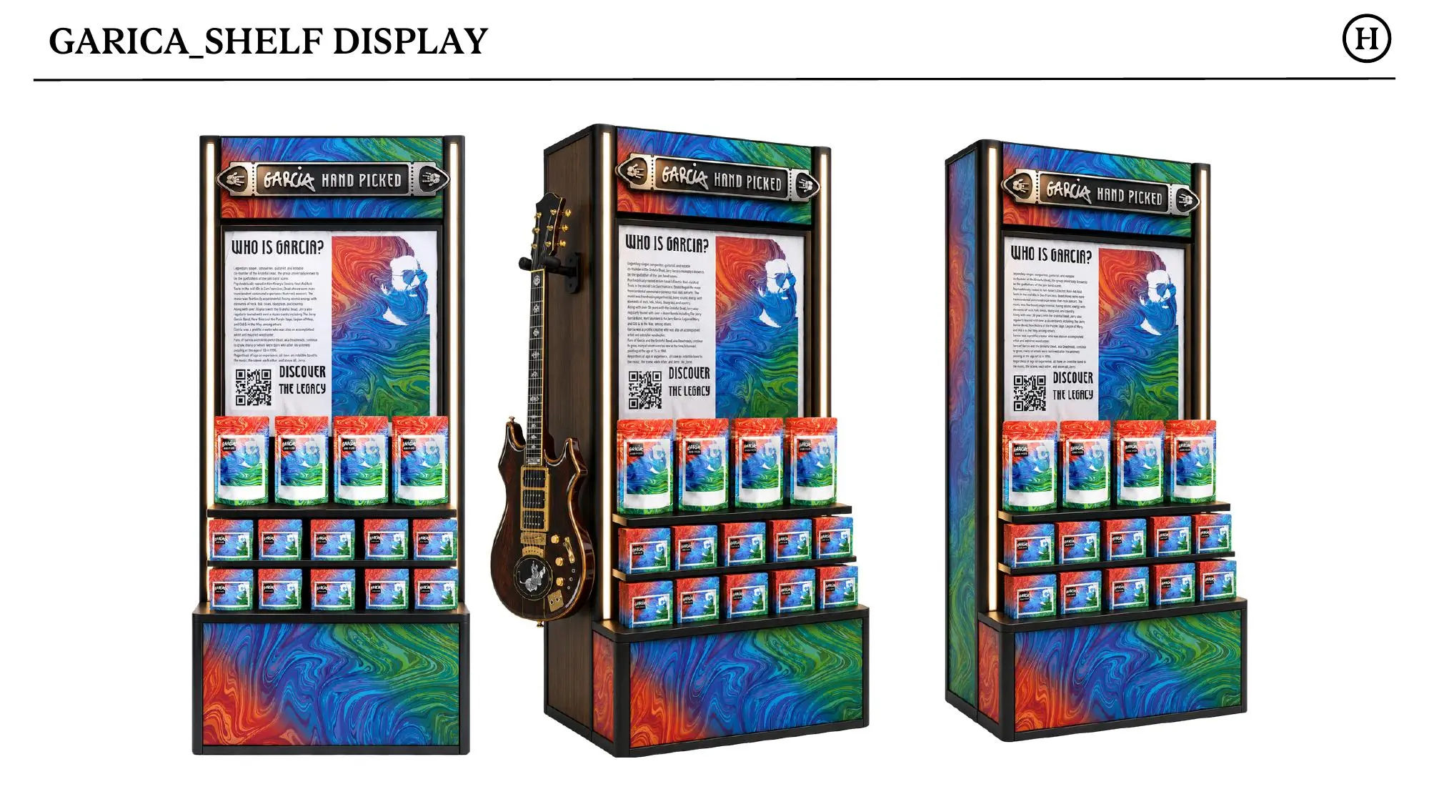
Form exploration — alternate freestanding shelf display concepts.
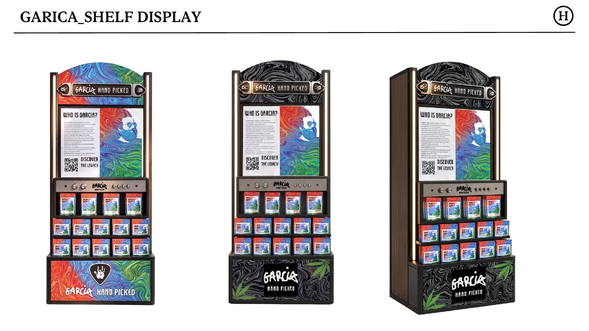
Direction development — additional options for the shelf display system.
07 / The takeaway
A familiar voice, carried into new formats.
Packaging, campaigns, illustration, and retail concepts extend the brand through different materials and scales. The work demonstrates how an established identity can stay recognizable while adapting to the needs of a new market, a specific event, or a physical space.
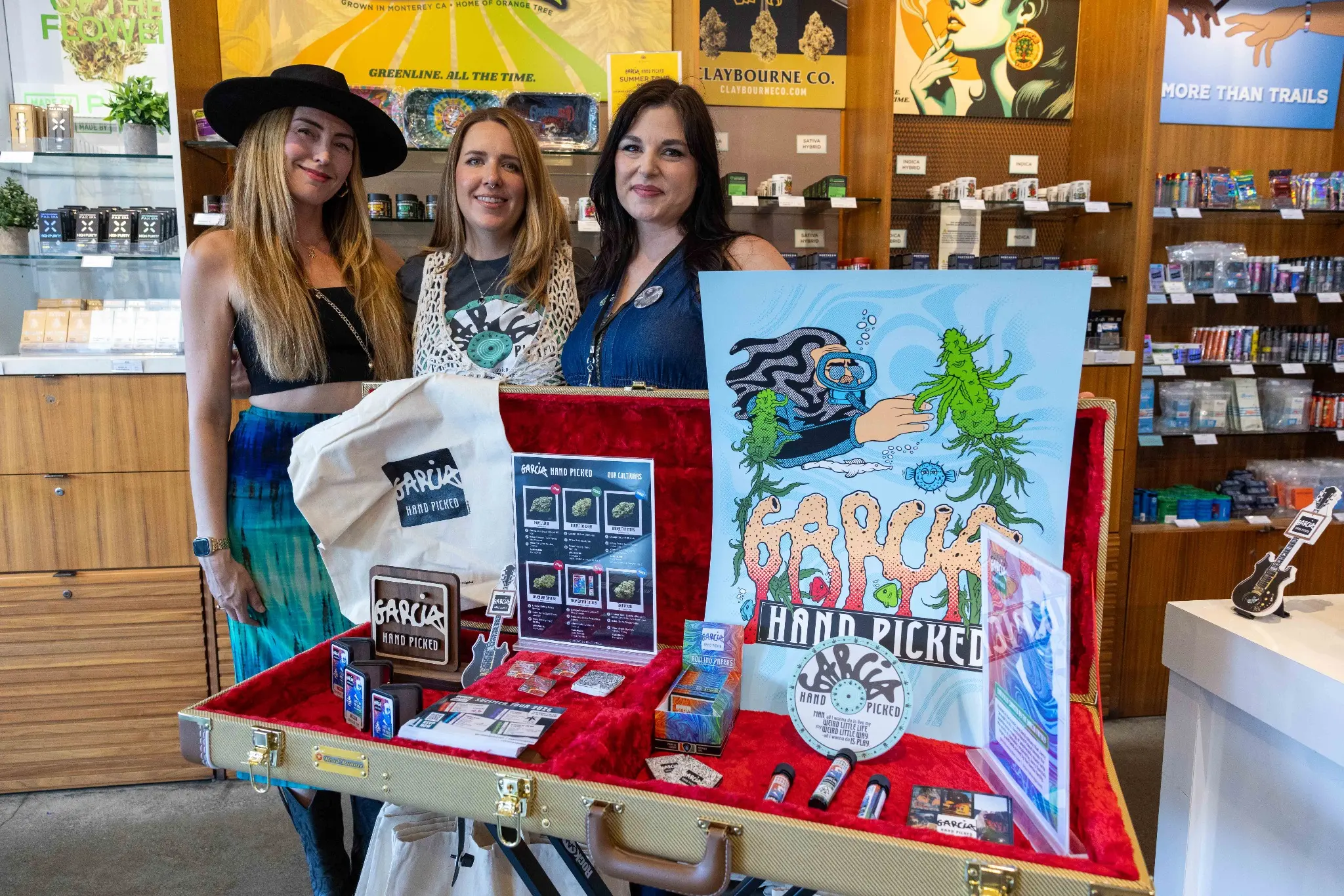
Garcia HandPicked in context — an activation display with people and products.