Case study / Working draft
DO DROPS
Client
DO DROPS
Focus
Identity, packaging & retail
My role
Brand identity & packaging design
01 / The idea & visual research
Give every mood its own atmosphere.
The design challenge was to make a family of effect-led edibles easy to recognize through more than a flat color code. Aura photography and modern-mystic references informed an expressive direction: gradients, glow, and diffused color that give each formula a distinct visual world.

Visual research — aura photography and atmospheric color fields.
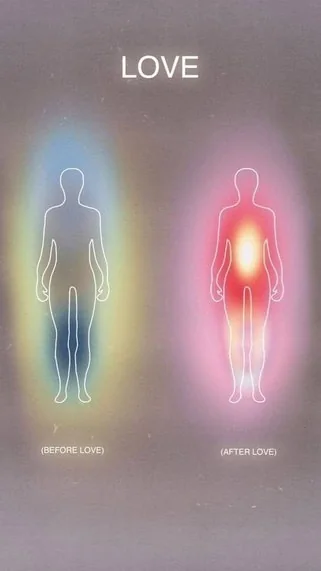
Visual research — luminous gradients and the visual language of feeling.
02 / Identity & packaging
A clear system within the color.
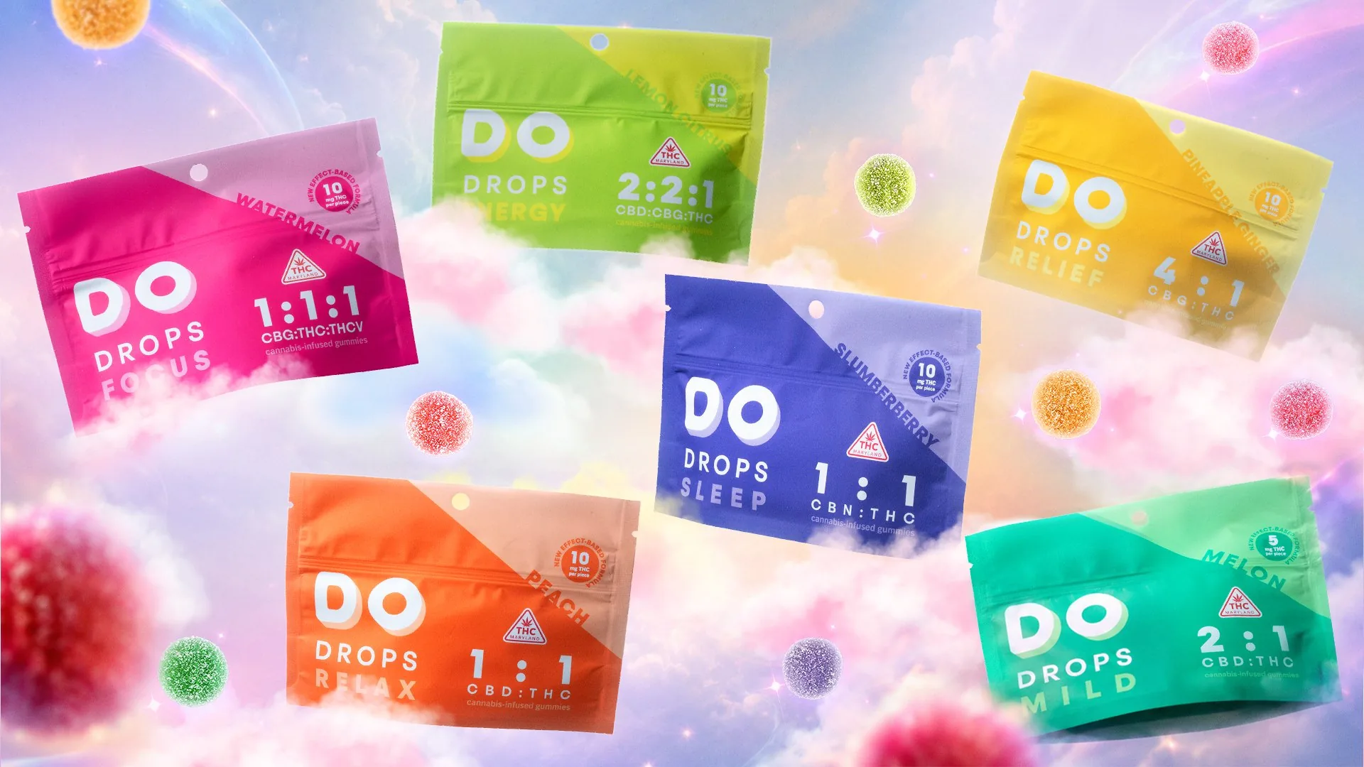
A shared pouch layout keeps the brand name and product information in a consistent hierarchy. Color distinguishes the range, while flavor, named effect, and cannabinoid ratio help organize the six-product family. The expressive identity works alongside information that is easy to find.

The packaging family — a shared identity with a distinct color for each formula.

The product system — connecting flavor, named effect, and cannabinoid ratio.
03 / The mood worlds
Two moods. One visual language.
Focus and Sleep show how the same system adapts across the range. Pink and lavender environments build on the colors of the respective pouches, using clouds, glow, and depth to give each product its own atmosphere while keeping the campaign recognizable as DO DROPS.

Focus / Watermelon — the packaging color extends into its campaign environment.

Sleep / Slumberberry — a different mood within the same visual system.
04 / Retail displays
Bring the aura onto the counter.
The packaging language expands into modular counter displays. Cloud fields, circular typography, and gummy forms frame the product, while matching color fields connect each display with its pouch. The system gives individual formulas a presence within the larger family.
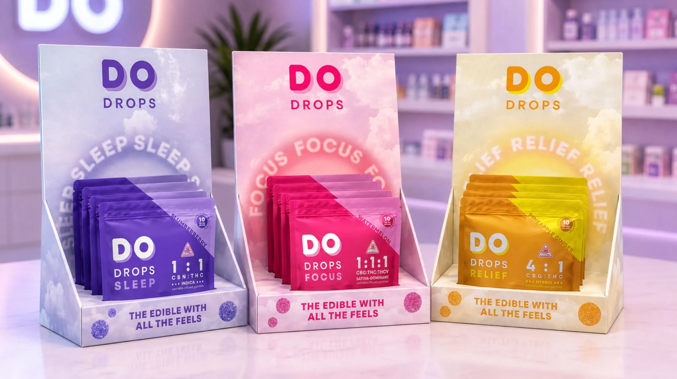
Point of sale — Sleep, Focus, and Relief translated into a coordinated display system.
05 / Lifestyle & merchandise
An identity beyond the pouch.
Apparel, accessories, and lifestyle imagery extend the brand into everyday settings. Iridescent materials, bright color, and the DO DROPS identity carry the same visual character across fabric, printed merchandise, and photography.
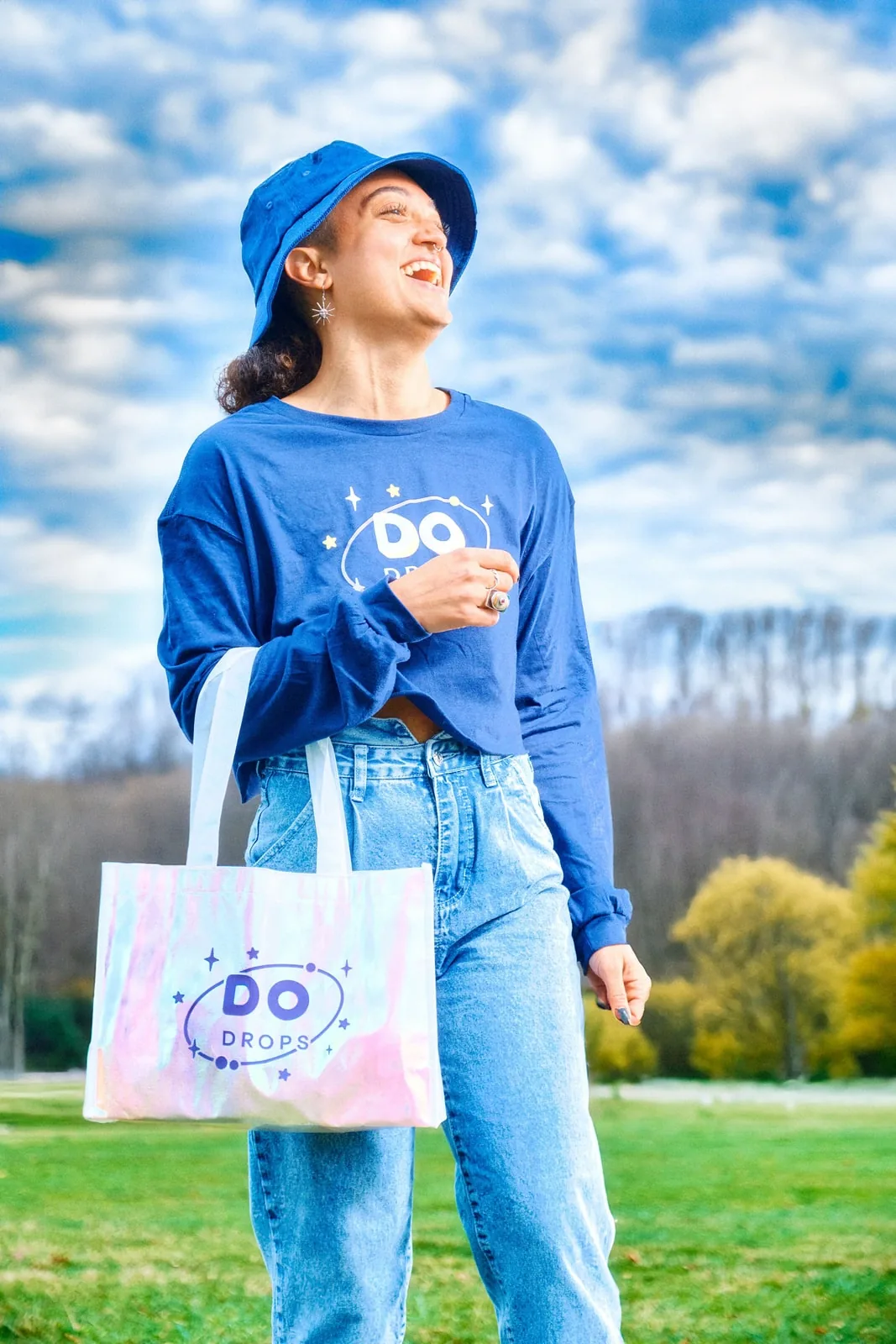
Lifestyle application — branded apparel and an iridescent tote outdoors.

Merchandise — the identity applied to a cap, tote, pins, and stickers.
06 / The Pride edition
Make the material part of the idea.
The Pride edition brings individuality into the product through a Starfruit flavor, glitter-infused gummies, and a holographic pouch. Selective white-ink knockouts reveal the prismatic film. Affirmation cards and launch imagery extend the message across the wider campaign.
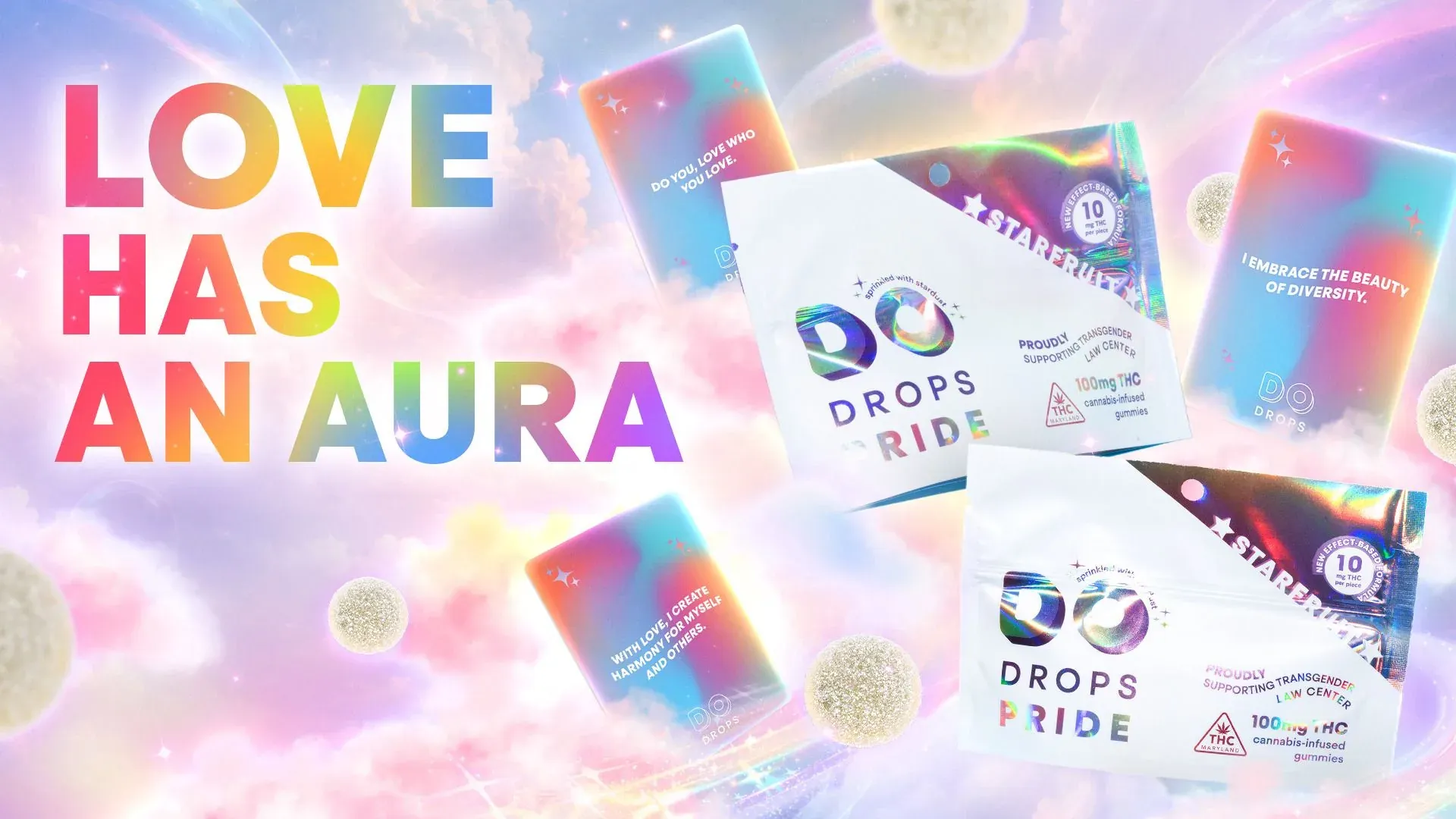
Pride launch creative — a rainbow color world and the “Love has an aura” message.
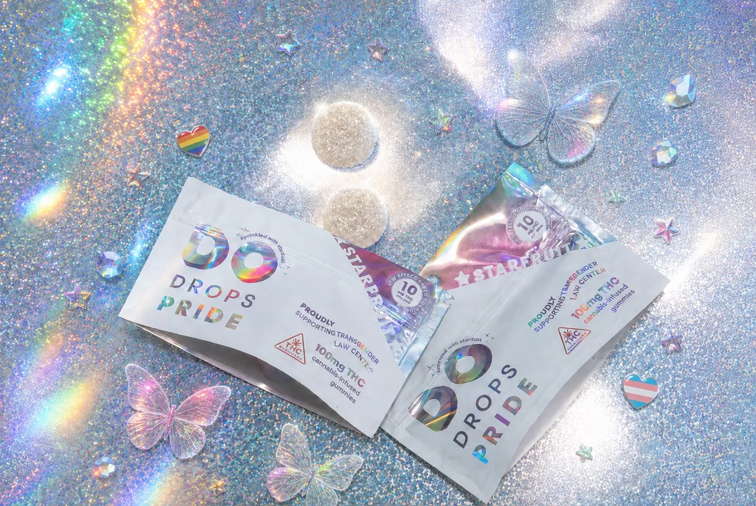
Packaging detail — holographic material becomes part of the brand expression.
07 / The takeaway
A connected spectrum of expression.
An aura-inspired visual language connects the product family across packaging, campaigns, retail, and merchandise. Consistent information and recurring brand elements hold the system together, giving each flavor and formula room for its own expression.
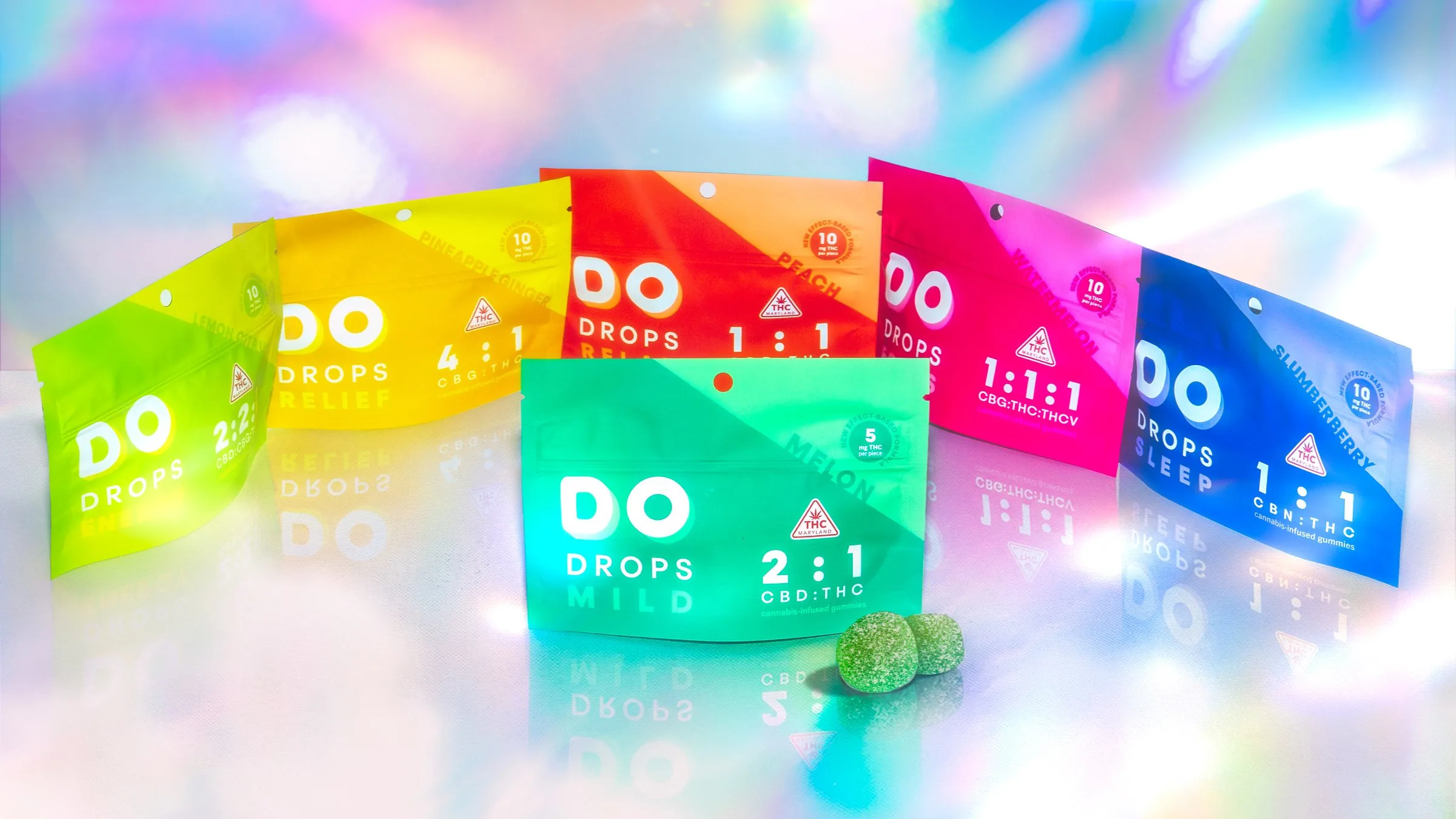
The complete product family — distinct expressions within one connected system.