Case study / Working draft
Hellavated
Client
Hellavated
Focus
Brand evolution & packaging
My role
Packaging, product graphics & retail design

01 / The starting point
Make room for a growing range.
Hellavated’s earlier identity used dark palettes, distressed textures, and irreverent illustration. As the product range expanded, the visual language needed to accommodate more flavors and formats while retaining the brand’s recognizable attitude.
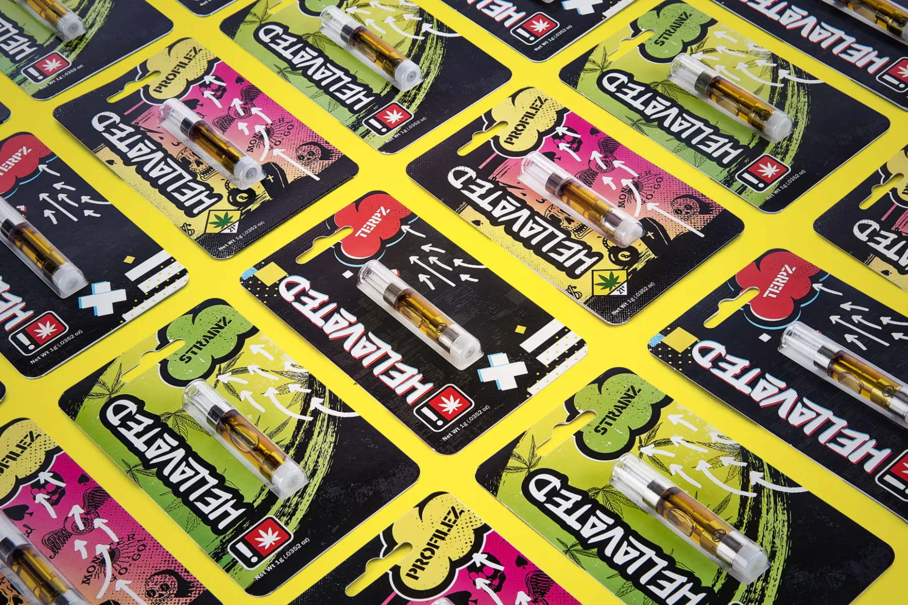
Design archive — earlier Hellavated vape packaging.
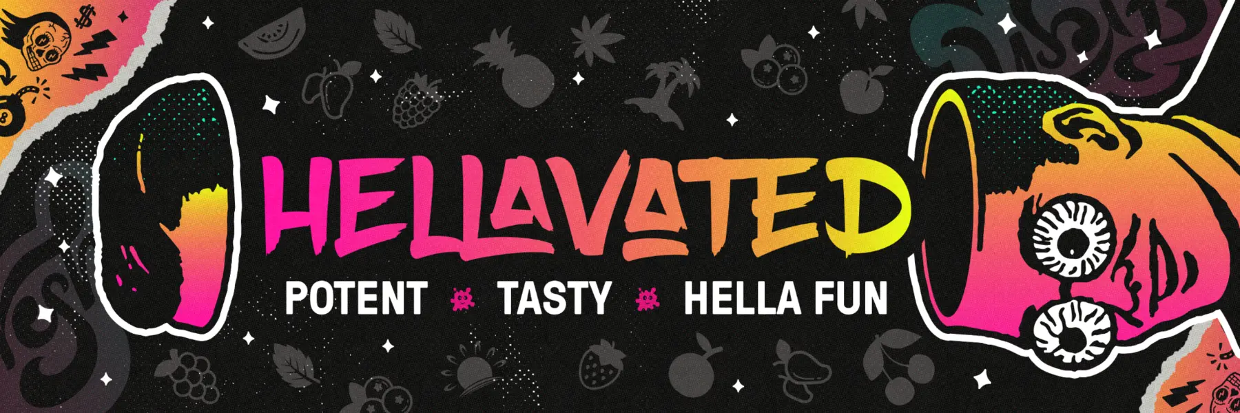
Design archive — the original distressed graphic language in a retail banner.
02 / The creative direction
Make flavor the starting point.
The evolved direction combines cosmic depth, oversized fruit, glossy liquid movement, and electric color. Fruit communicates flavor, color distinguishes products, and a shared visual environment connects the range. The established logo and attitude remain points of recognition.

The evolved graphic language — galaxy depth, fruit, liquid movement, and saturated color.
03 / The packaging system
Keep the hierarchy clear across packs.
A consistent hierarchy puts the brand first, the format second, and flavor in clear view. The 510 cartridge and all-in-one packaging show how that framework adapts to different products, with individual color worlds and fruit imagery within the shared system.
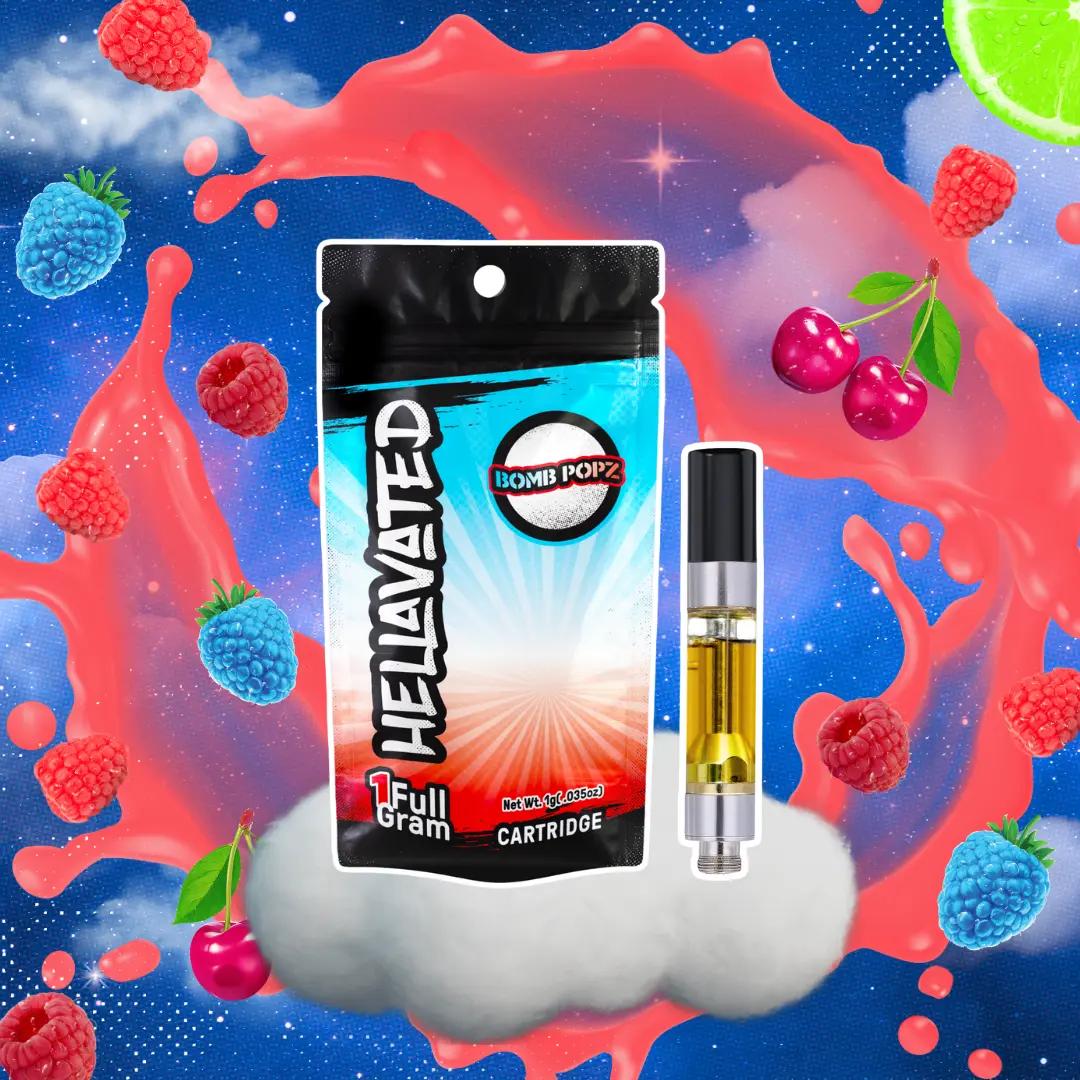
510 cartridge / Bomb Popz — format and flavor organized within the brand system.
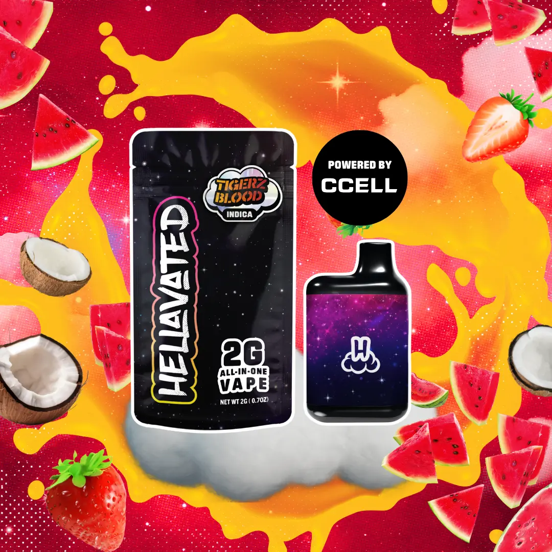
All-in-one / Tigerz Blood — the same hierarchy adapted to a different product.
04 / Product graphics
Carry the identity onto the device.
Color, finish, logo placement, and flavor cues extend the packaging story onto the product itself. The device becomes another expression of the identity, connecting the appearance of the pack with the object someone holds.
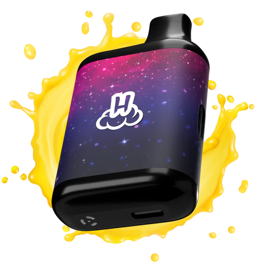
Product visualization — cosmic graphics and branded details applied to the device.
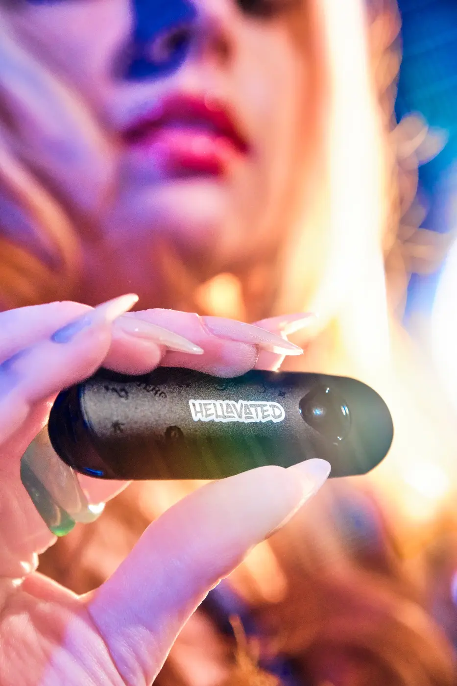
In-hand presentation — the device as part of the wider brand expression.
05 / Format expansion
A shared system with room to stretch.
Gummies, concentrates, and infused pre-rolls introduce different packaging requirements. Recurring fruit imagery, cosmic backgrounds, and information hierarchy connect those formats, while each product keeps its own flavor and color cues.

Gummiez variety pack — the visual system extended into edible packaging.
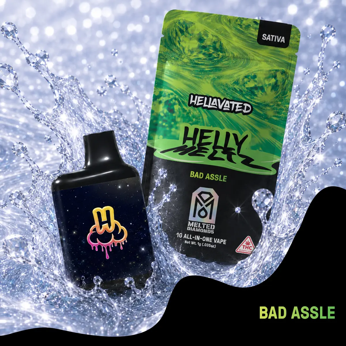
Helly Meltz / Bad Assle — packaging and product presentation.
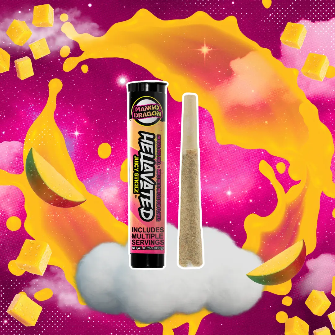
Juicy Stickz / Mango Dragon — the identity adapted to an infused pre-roll format.
06 / Retail & launch creative
Organize the range at retail scale.
Launch artwork and point-of-sale graphics carry the system beyond individual packs. Larger brand elements establish recognition from a distance, while product imagery, flavor cues, and format information organize the range up close.

Extract launch creative — the graphic language applied to a product introduction.
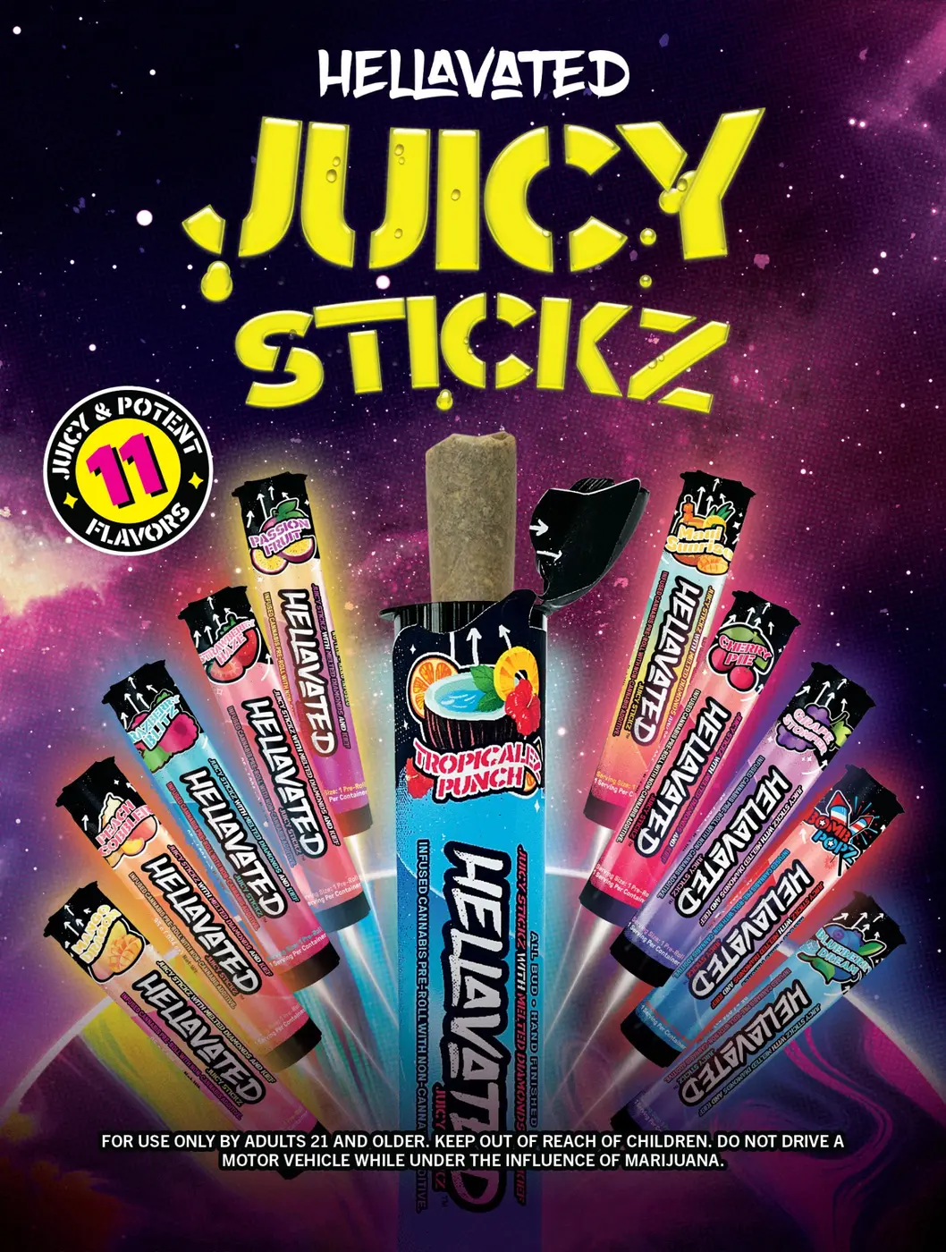
Juicy Stickz — point-of-sale poster application.

Tropicalz — a related retail graphic within the broader brand system.
07 / Lifestyle imagery
Build a world around the products.
Colored light, cosmic atmosphere, bold styling, and fruit-forward props extend the identity into lifestyle imagery. The products remain part of a recognizable visual environment across different scenes and formats.
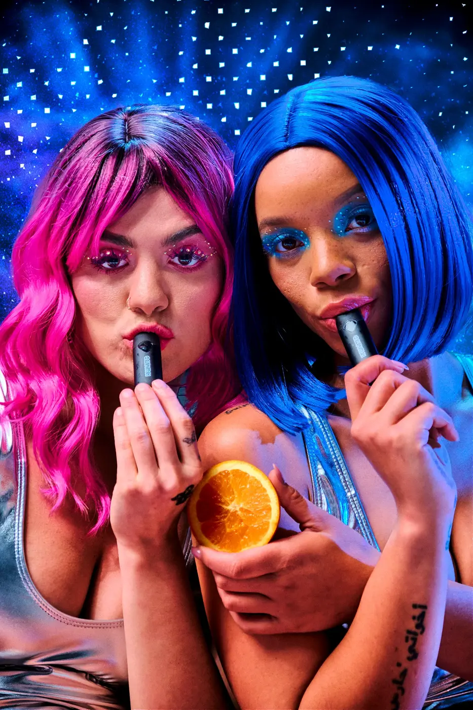
Lifestyle direction — color, styling, and atmosphere connect the scene to the packaging.

Flavor-led imagery — an infused pre-roll paired with dragonfruit.
08 / Limited releases & takeaway
Leave room for the next flavor.
Baja Blastoff shows how a limited release can shift the fruit, color, and atmosphere within the established system. The evolution gives Hellavated a flexible visual language that can grow across products and campaigns while retaining its familiar character.
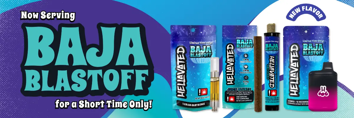
Baja Blastoff — limited-release campaign artwork within the evolved Hellavated identity.