Case study / Working draft
Strane
Client
Strane / Holistic Industries
Focus
Packaging & brand applications
01 / The starting point
Keep the recognition. Shift the attitude.
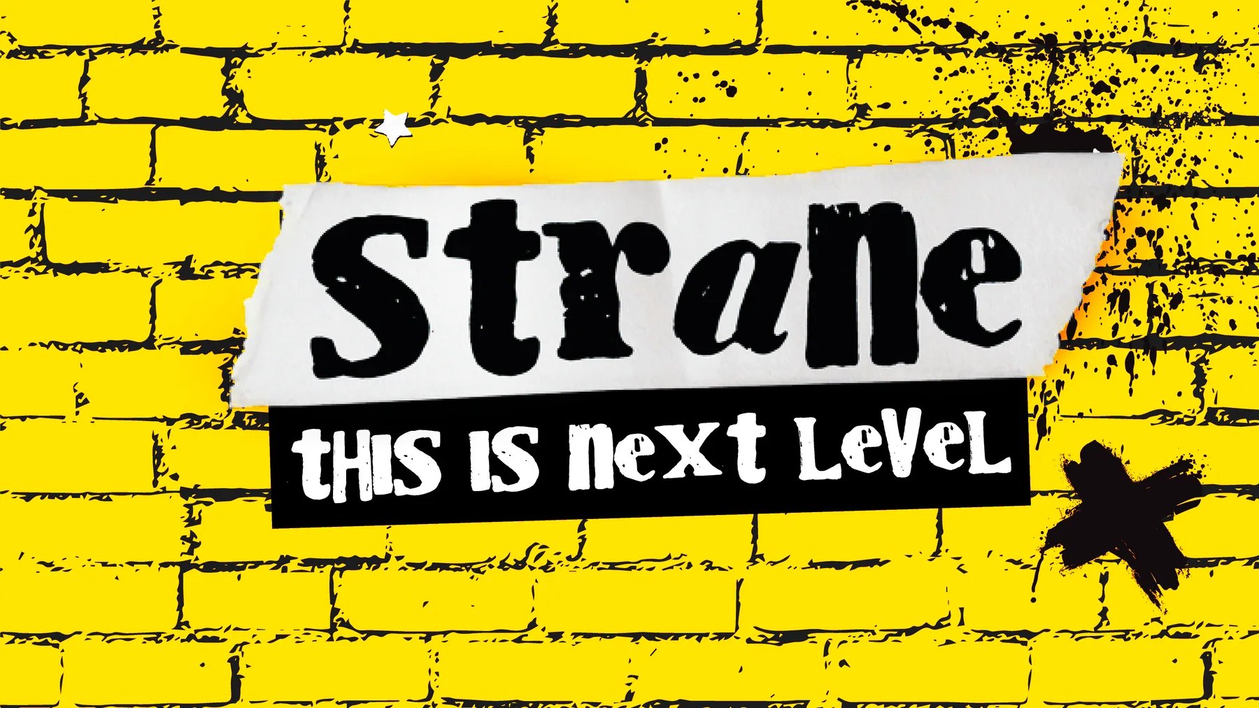
Strane already had a recognizable foundation: yellow, black, and three expressive eyecons. The brief was to build on those familiar cues with a bolder visual language that could carry across packaging and brand applications.
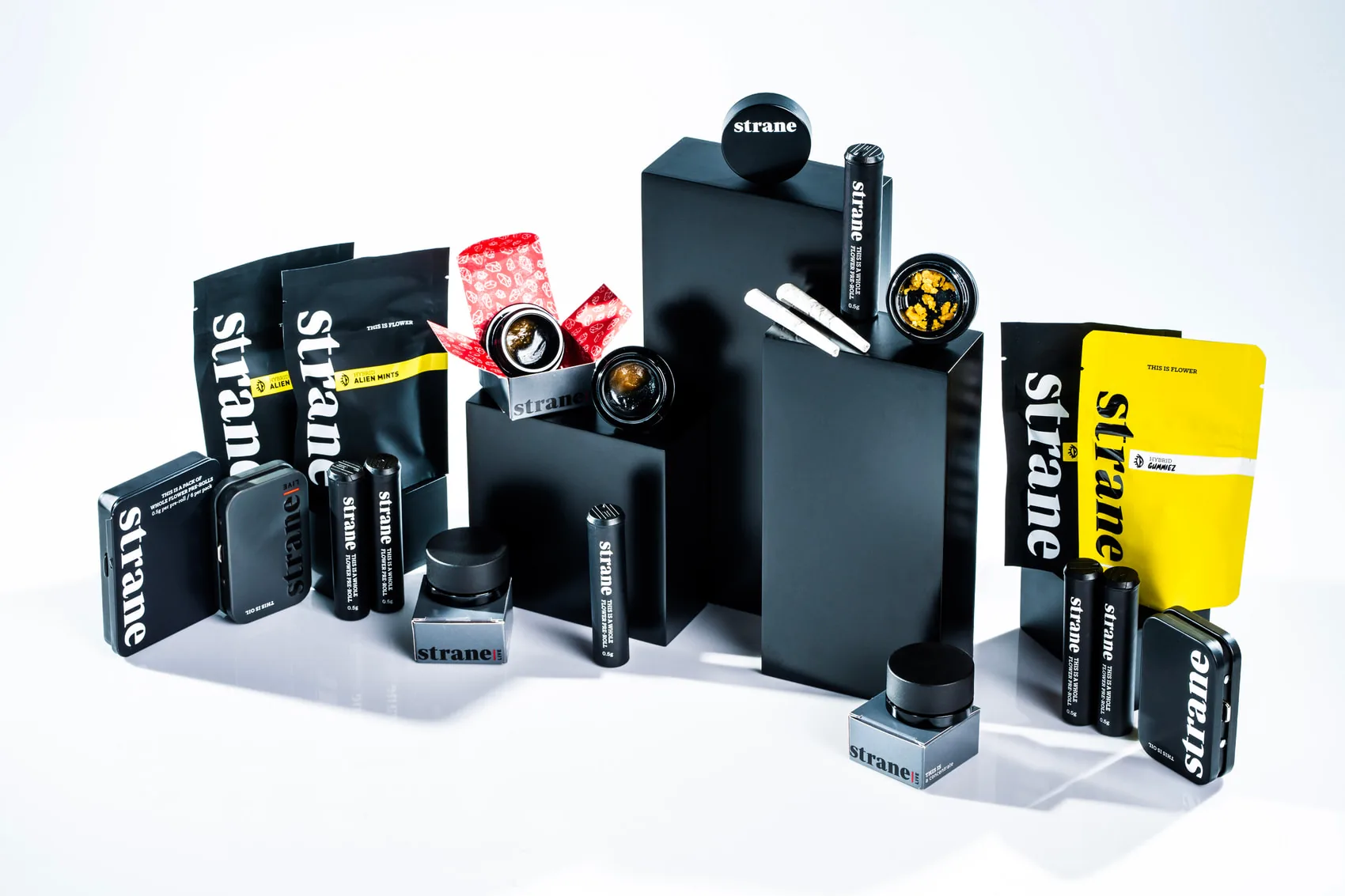
The original yellow-and-black packaging.

The existing system provided the starting point.
02 / Creative direction
A language of cut, paste, and contrast.
Punk references informed the creative direction: distressed lettering, ripped paper, halftone imagery, and layers of wheat-paste graphics. Yellow brick ties those elements together, while the familiar eyecons remain a point of recognition.
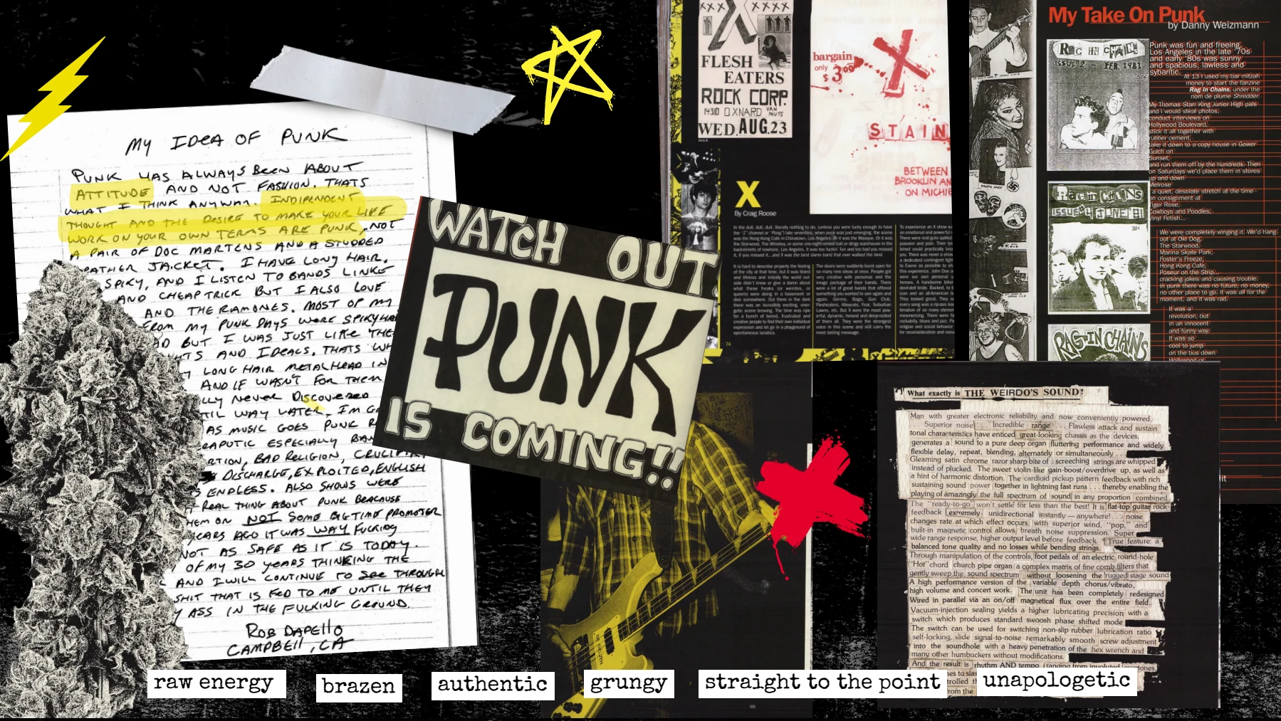
Reference gathering and visual direction — punk ephemera, photocopy texture, and cut-and-paste typography.
03 / Packaging system
One identity. Room for every strain.
A shared yellow-and-black framework connects the range. Each strain has its own collage imagery, while recurring typography, eyecons, and graphic elements keep the family recognizable across flower pouches, vapes, and pre-rolls.
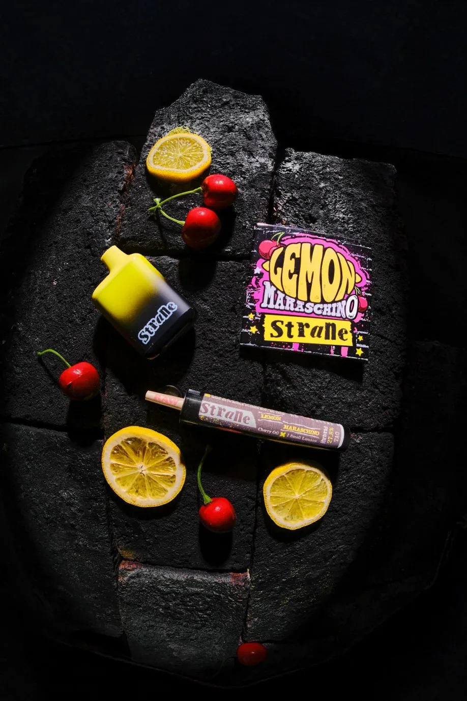
Lemon Maraschino — one strain identity translated across formats.
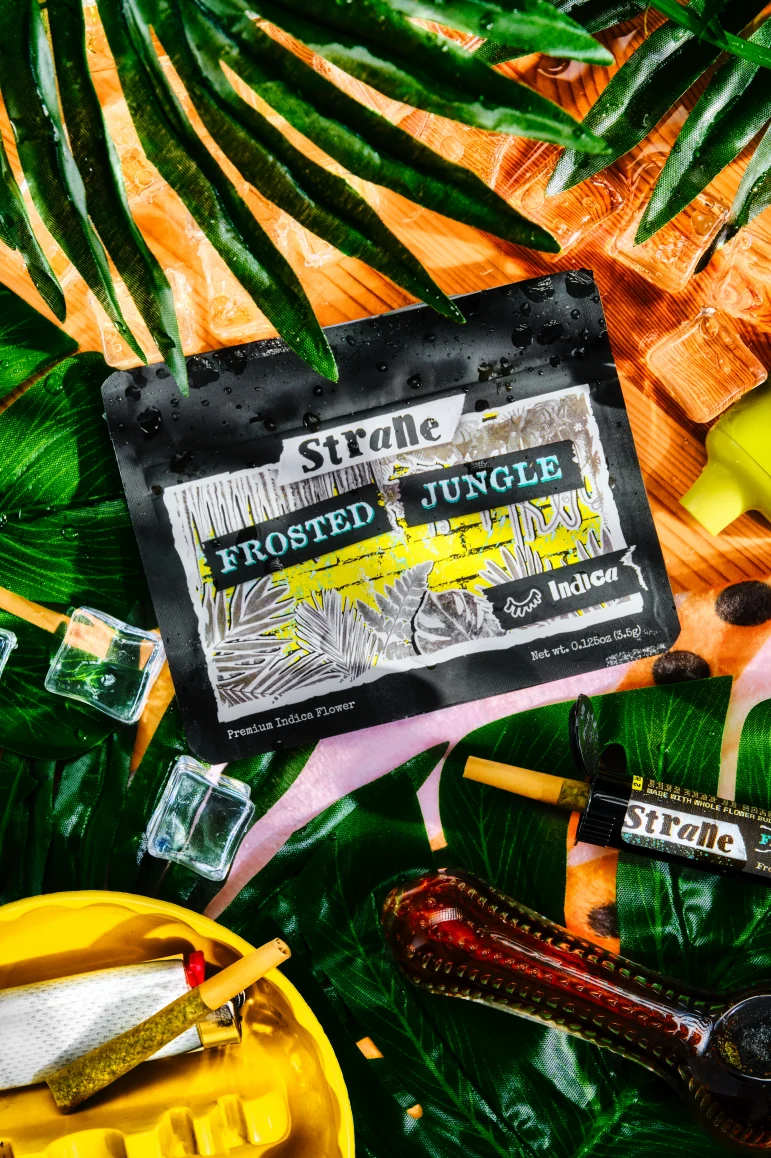
Frosted Jungle — packaging and product imagery.
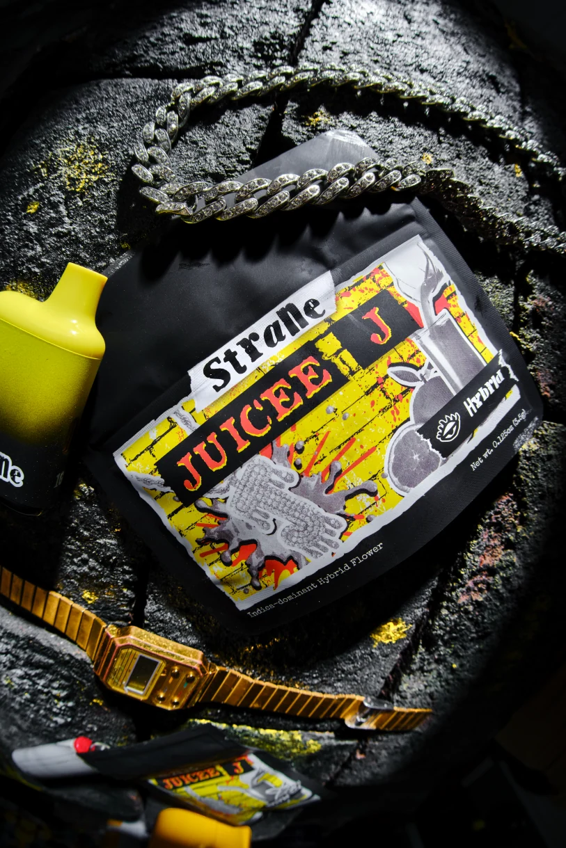
Juicee J — a different expression within the same system.
04 / Beyond the packaging
From a small pack to a shared space.
The same graphic language extends into retail displays and event environments. Yellow brick becomes a backdrop at a larger scale, connecting product displays with the co-branded Strane × Hellavated Flower Expo activation.
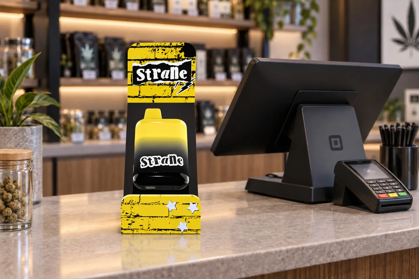
Retail — a display that carries the packaging language into the store.
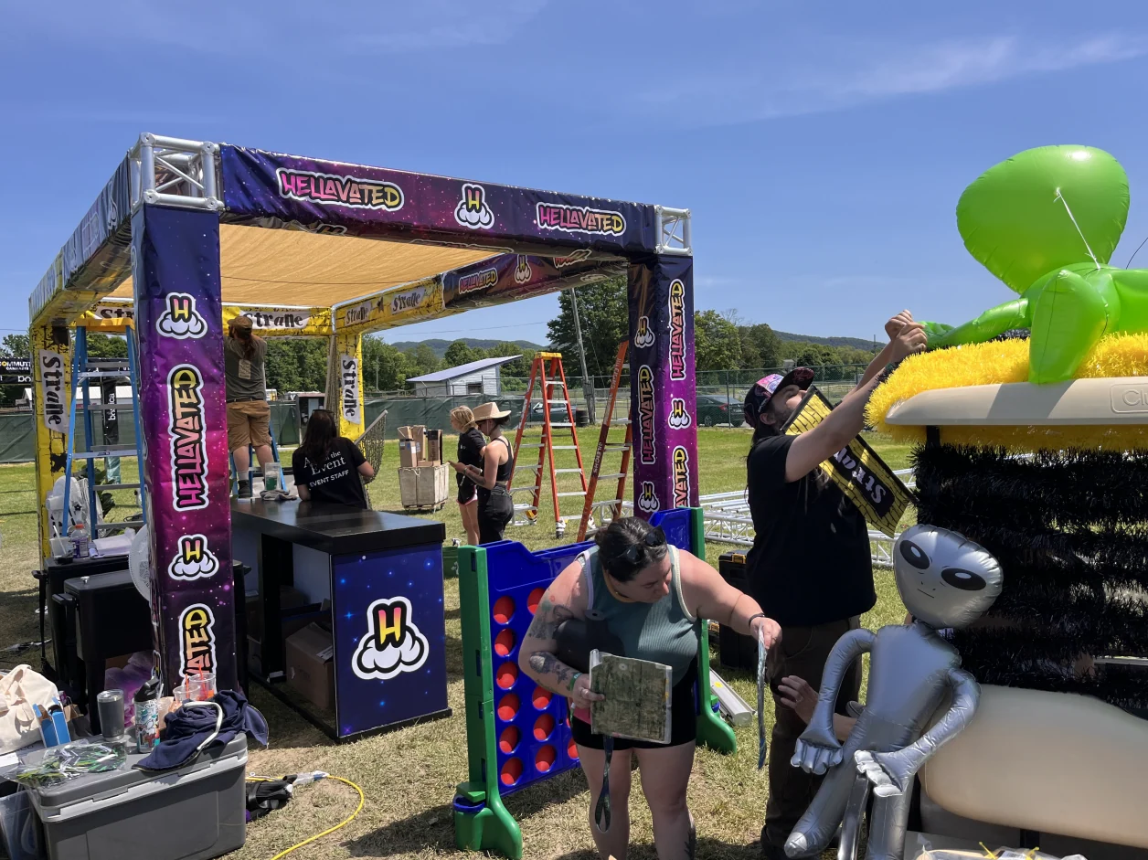
Flower Expo — the identity applied to a co-branded booth.
05 / The takeaway
A more expressive, connected brand.
Yellow, black, and the eyecons remain the anchors. A flexible collage language gives Strane a more expressive presence across packaging, merchandise, retail, and events.

The connected brand family across products, packaging, and merchandise.