Rebrand / Blazing Trails

AVITAS — Blazing Trails

Reimagining AVITAS for people drawn to trails, mountains, and the coast through an illustrated brand system, packaging, a hiking mascot, and a website concept built around a trail map.

Reimagining AVITAS for people drawn to trails, mountains, and the coast through an illustrated brand system, packaging, a hiking mascot, and a website concept built around a trail map.

Client

AVITAS / Oregon & Washington

Focus

Brand identity, packaging & digital

My role

Brand design, illustration & UI/UX

Year

2024

01 / The original identity

A recognizable starting point.

Anchored by AVITAS Blue (PMS 3265 C), a distinctive turquoise reminiscent of Tiffany Blue, the original identity used restrained layouts, white space, and clear labeling. The design supported the brand’s messaging around pesticide-free cultivation, natural products, and no additives. The rebrand began with that established color recognition.

Anchored by AVITAS Blue (PMS 3265 C), a distinctive turquoise reminiscent of Tiffany Blue, the original identity used restrained layouts, white space, and clear labeling. The design supported the brand’s messaging around pesticide-free cultivation, natural products, and no additives. The rebrand began with that established color recognition.

Original identity — turquoise and white presentation packaging.

Original cartridge packaging — a minimal layout with product color cues.

02 / The creative direction

Bring the outdoors into the identity.

The brief was to give this Oregon brand, also present in Washington, a stronger connection to hikers and people who enjoy the outdoors. I drew inspiration from the landscape energy of Mountain Dew and the outdoor character of Patagonia, EMS, and L.L.Bean. Mount Hood, forests, water, and an orange sun became the foundation of a more expressive visual world.

The brief was to give this Oregon brand, also present in Washington, a stronger connection to hikers and people who enjoy the outdoors. I drew inspiration from the landscape energy of Mountain Dew and the outdoor character of Patagonia, EMS, and L.L.Bean. Mount Hood, forests, water, and an orange sun became the foundation of a more expressive visual world.

Main illustration — Mount Hood, evergreen forest, and reflected water.

03 / The logo system

The mark becomes a trail badge.

The logo system combines a bold wordmark with mountain silhouettes, trees, and a setting sun. Framed marks and hexagonal badges bring the feel of outdoor patches and trail signage into the identity. Full-color, monochrome, and compact versions provide options for packaging, digital screens, and smaller applications.

The logo system combines a bold wordmark with mountain silhouettes, trees, and a setting sun. Framed marks and hexagonal badges bring the feel of outdoor patches and trail signage into the identity. Full-color, monochrome, and compact versions provide options for packaging, digital screens, and smaller applications.

Logo system — full-color signatures, wordmark, monogram, and a badge family for different scales and applications.

04 / Color & supporting graphics

Color, texture, and trail signs.

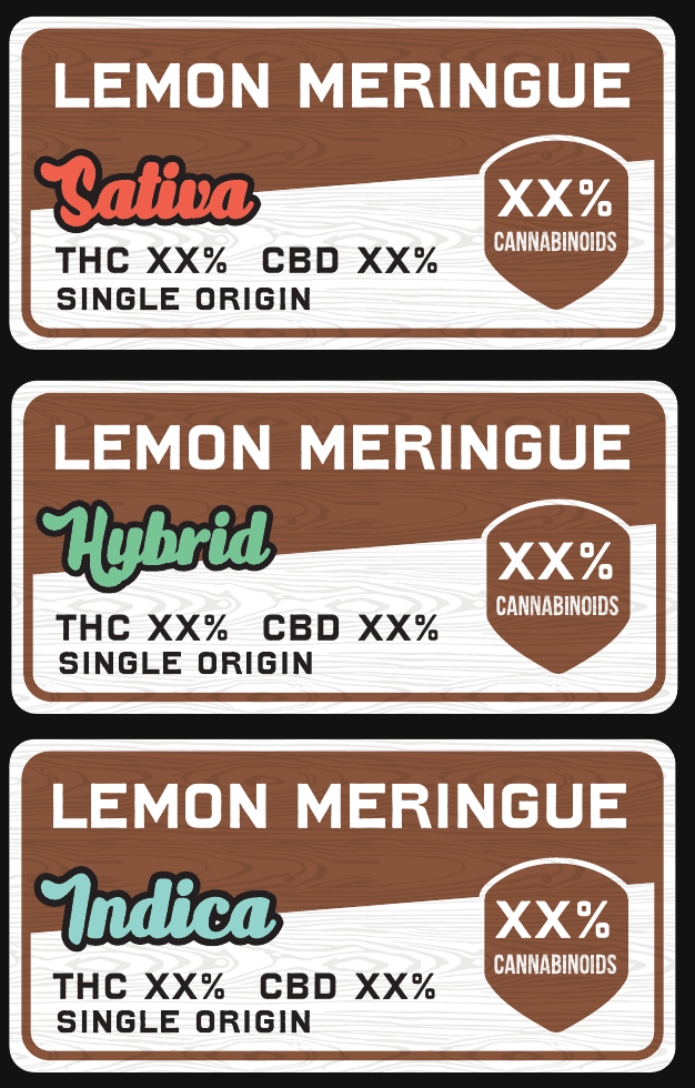
AVITAS Blue remains the recognizable anchor. Ivory, charcoal, warm orange, and brown expand the palette into a landscape of sun, wood, and stone. Supporting colors distinguish product classifications, while wood grain, rough borders, forest silhouettes, and sign-shaped labels connect the packaging to the outdoor idea.

AVITAS Blue remains the recognizable anchor. Ivory, charcoal, warm orange, and brown expand the palette into a landscape of sun, wood, and stone. Supporting colors distinguish product classifications, while wood grain, rough borders, forest silhouettes, and sign-shaped labels connect the packaging to the outdoor idea.

AVITAS Blue (PMS 3265 C) anchors a palette of ivory, charcoal, and warm orange.

Supporting colors distinguish Indica, Sativa, and Hybrid; wood grain adds texture while keeping product information clear.

05 / Typography

Typography with an outdoor character.

The type system gives each style a clear job. Devil’s Breath adds a rugged display voice, Bebas Neue Bold organizes compact product information, and Boldka Script brings a hand-lettered accent. Rubik keeps body copy approachable and easy to read. Together, the four styles balance outdoor character with a practical hierarchy across packaging and digital screens.

The type system gives each style a clear job. Devil’s Breath adds a rugged display voice, Bebas Neue Bold organizes compact product information, and Boldka Script brings a hand-lettered accent. Rubik keeps body copy approachable and easy to read. Together, the four styles balance outdoor character with a practical hierarchy across packaging and digital screens.

Brand typography — Devil’s Breath, Bebas Neue Bold, Boldka Script, and Rubik.

06 / The brand mascot

Meet the AVITAS hiker.

A simple figure with a hiking backpack and AVITAS-blue baseball cap brings a human presence into the landscape. The uncomplicated silhouette keeps the character recognizable across walking, welcoming, and celebratory poses. I see the mascot as a recurring trail companion that connects the brand’s outdoor personality with the website journey.

A simple figure with a hiking backpack and AVITAS-blue baseball cap brings a human presence into the landscape. The uncomplicated silhouette keeps the character recognizable across walking, welcoming, and celebratory poses. I see the mascot as a recurring trail companion that connects the brand’s outdoor personality with the website journey.

Mascot studies — a hiking figure with the signature blue cap and backpack.

07 / Packaging · Pre-rolls

Three Sisters, wrapped around the pack.

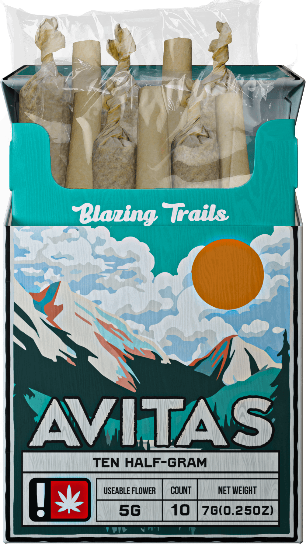
The pre-roll packaging takes its landscape from the Three Sisters. Illustrated peaks, clouds, and the orange sun establish the setting, while the AVITAS wordmark and strain information create a consistent hierarchy. The open-box views show how the identity continues across the front, sides, and lid.

The pre-roll packaging takes its landscape from the Three Sisters. Illustrated peaks, clouds, and the orange sun establish the setting, while the AVITAS wordmark and strain information create a consistent hierarchy. The open-box views show how the identity continues across the front, sides, and lid.

Three Sisters — peaks, forests, and reflected water interpreted in the AVITAS illustration style.

Landscape references — alpine peaks and the changing colors of light over water.
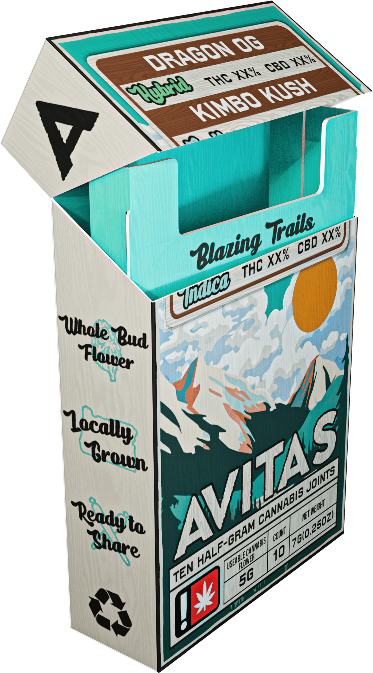
Pre-roll ten-pack — the mountain illustration wraps around the pack, while national park-inspired labels organize cultivar names, product classifications, and variable product data.

08 / Packaging · Live Resin

Crater Lake, illustrated for Live Resin.

Crater Lake provides the landscape for Live Resin. Mountains and reflected water create a distinct scene within the wider identity, while AVITAS Blue, the orange sun, the wordmark, and the label structure connect it to the rest of the range. The outdoor presentation places the packaging within the natural world that informs the illustration.

Crater Lake provides the landscape for Live Resin. Mountains and reflected water create a distinct scene within the wider identity, while AVITAS Blue, the orange sun, the wordmark, and the label structure connect it to the rest of the range. The outdoor presentation places the packaging within the natural world that informs the illustration.

Live Resin packaging — the Crater Lake illustration across related product variations.
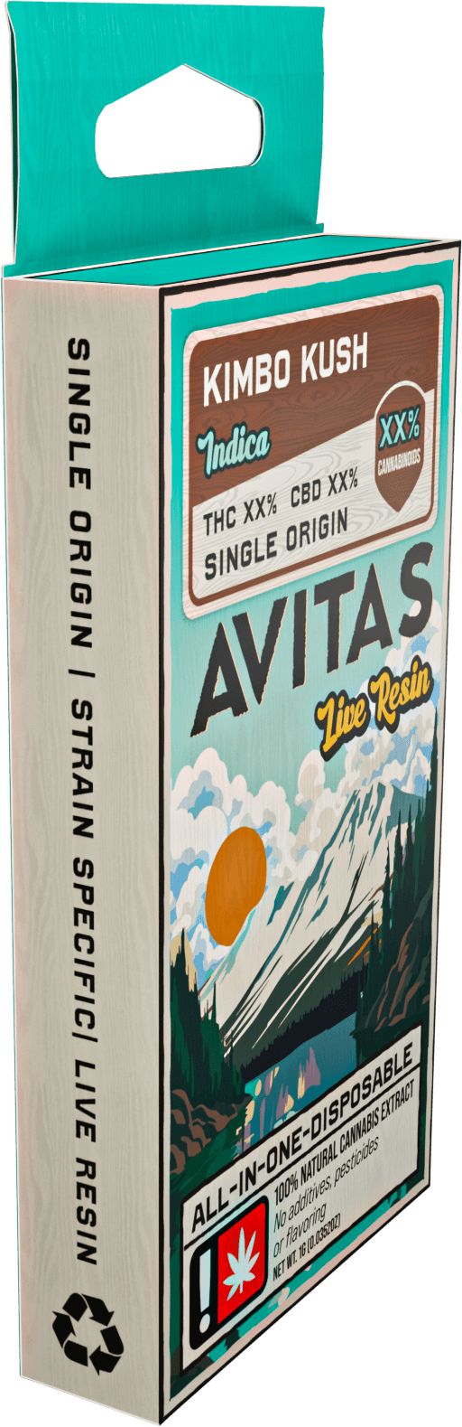
Inspired by Crater Lake, layered mountains and reflected water give Live Resin a distinct setting. The illustration continues around the carton, while a consistent trail-sign label keeps the cultivar, classification, and product details easy to locate.

09 / Packaging · Ultra

Ultra meets the Oregon coast.

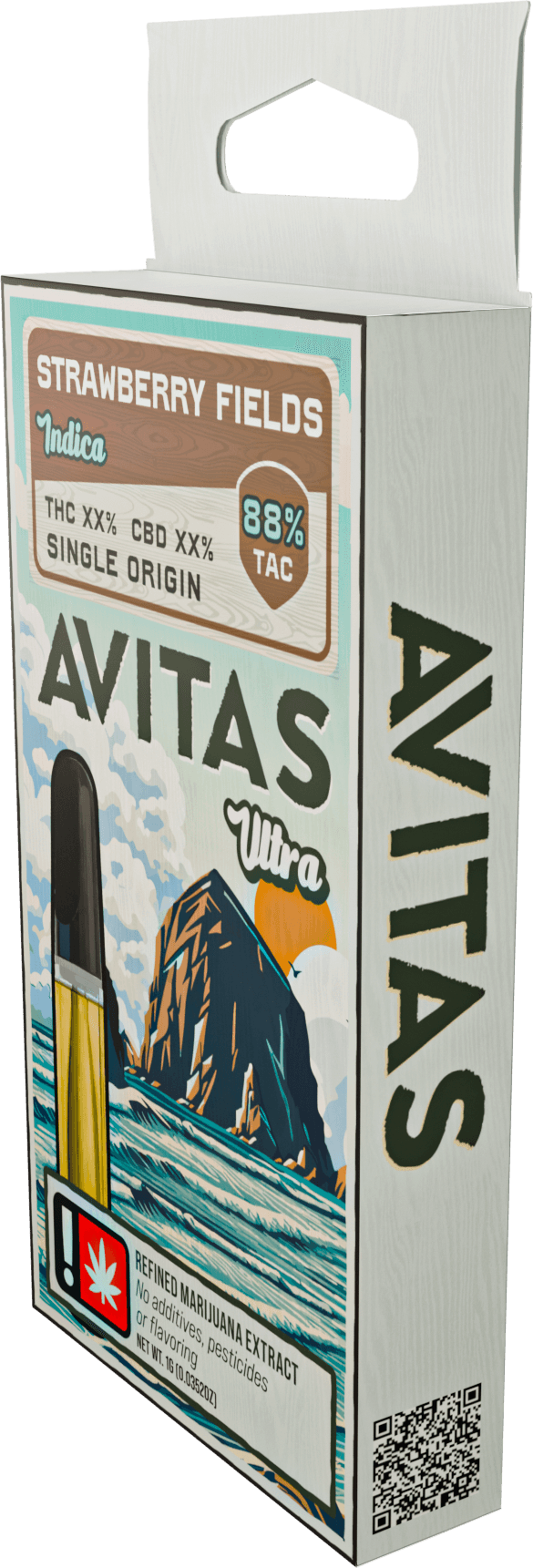
Haystack Rock gives Ultra its coastal identity. The prominent rock formation and ocean scene distinguish this product line while retaining the shared color, typography, and labeling system. An outdoor equipment composition shows how the packaging can sit within the hiking and camping world of the rebrand.

Haystack Rock gives Ultra its coastal identity. The prominent rock formation and ocean scene distinguish this product line while retaining the shared color, typography, and labeling system. An outdoor equipment composition shows how the packaging can sit within the hiking and camping world of the rebrand.

Ultra product presentation — Haystack Rock packaging within an outdoor equipment composition.

Haystack Rock brings the Oregon coast to Ultra. The rock silhouette, rolling waves, and warm sun give the line its own character, while an ivory background and the shared label system connect it to the wider AVITAS range.

10 / Brand applications

Take the identity beyond the box.
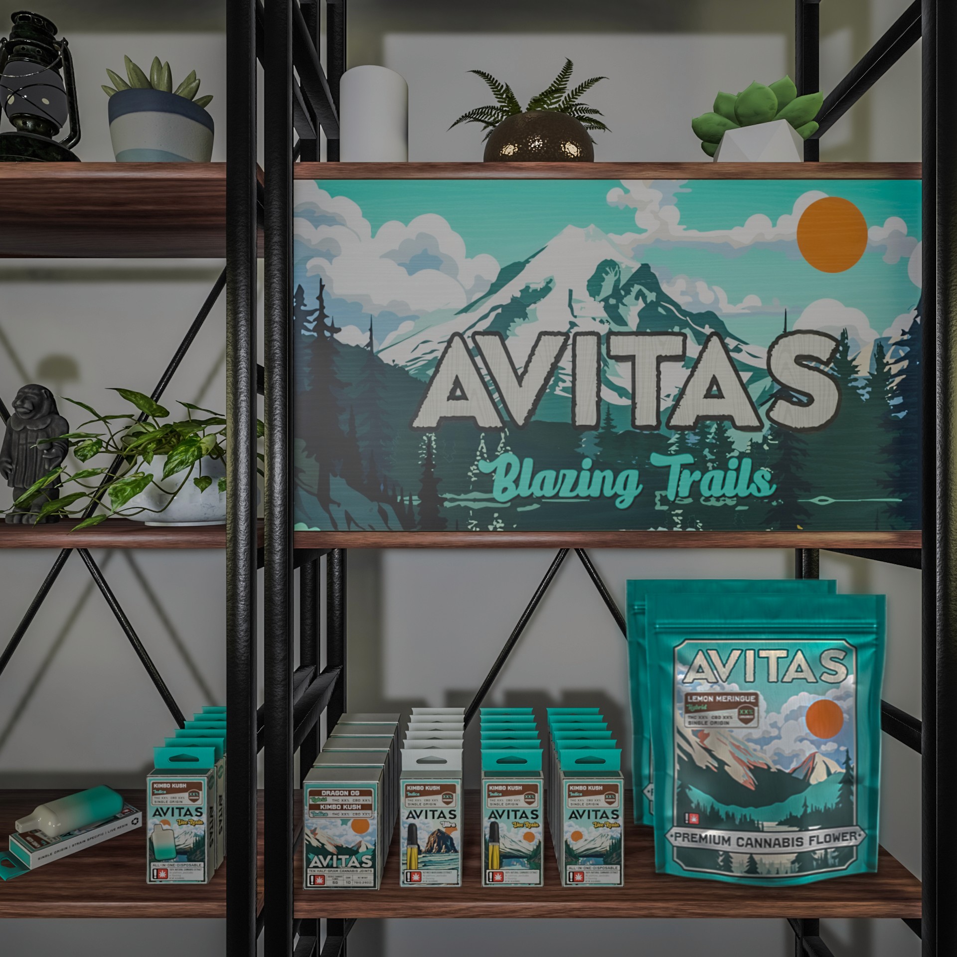
Retail and mural mockups explore how the identity can move from a small package to a larger setting. The same landscape, sun, wordmark, and Blazing Trails message connect the applications. These visualizations show how the system can adapt while keeping a recognizable character.

Retail and mural mockups explore how the identity can move from a small package to a larger setting. The same landscape, sun, wordmark, and Blazing Trails message connect the applications. These visualizations show how the system can adapt while keeping a recognizable character.

Retail presentation mockup — signage and the packaging family together.
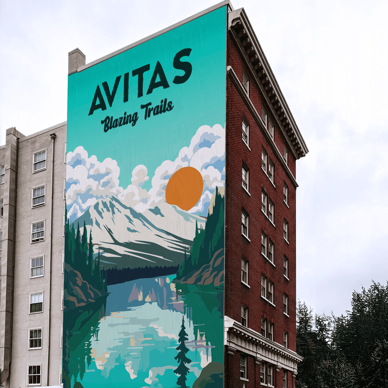
Mural visualization — Mount Hood and the AVITAS identity at building scale.

11 / Website concept · The trail map

Turn navigation into a trail.

The website concept extends the outdoor idea into navigation. An illustrated trail map invites visitors to explore products, events, budtender content, and the brand story as points of interest. A familiar header also provides direct routes to products and the store locator, supporting visitors who arrive with a specific destination in mind.

The website concept extends the outdoor idea into navigation. An illustrated trail map invites visitors to explore products, events, budtender content, and the brand story as points of interest. A familiar header also provides direct routes to products and the store locator, supporting visitors who arrive with a specific destination in mind.

Navigation concept — illustrated routes and points of interest organize the brand world.

Figma homepage concept — Mount Hood introduces the journey into the trail map.

Cultivar browsing — six trail-sign cards pair flower photography with names, classifications, and lineage.

Figma cultivar interaction — flower graphics appear above trail-sign cards, bringing the browsing experience to life while keeping names and classifications visible.

12 / Website concept · Practical destinations

From discovery to useful information.

The supporting screens turn the illustrated world into practical destinations: cultivar browsing with product classifications, and a store-locator layout with ZIP-code search, a map, and dispensary details. These concepts carry the same sign shapes, wood texture, and typography from the packaging into the website, creating a continuous brand experience.

The supporting screens turn the illustrated world into practical destinations: cultivar browsing with product classifications, and a store-locator layout with ZIP-code search, a map, and dispensary details. These concepts carry the same sign shapes, wood texture, and typography from the packaging into the website, creating a continuous brand experience.

Figma store-locator concept — direct search and location information within the outdoor identity.

13 / A connected brand system

One identity, rooted in place.

The rebrand builds on AVITAS Blue with Oregon landscapes, a flexible logo family, and a hiker mascot. I carried that visual language from packaging into retail and website concepts, giving each product a setting of its own while keeping the range connected. The result is a cohesive direction shaped by the places and outdoor culture at the heart of the brief.