Packaging / Illustration
Fruit & Flowers by AVITAS
Client
AVITAS / Oregon
Focus
Illustration & packaging
My role
Illustration & packaging artwork
Year
2022

01 / The brief & first direction
A handmade starting point.
AVITAS wanted its Oregon gummy line to convey an organic, small-batch feel through hand-drawn illustration, with Wyld and KIVA named as the main competitors. I began with the brand’s established turquoise, surrounding the Wild Strawberry label with illustrated fruit, leaves, and blossoms.

Early concept — Wild Strawberry in the original turquoise direction.
02 / Illustration & layout studies
Finding the right balance.
I explored how the botanical illustrations could work as a repeat pattern and wrap around the circular tin. Alongside those studies, I developed alternative label layouts to test the relationship between the AVITAS mark, flavor name, and product information.

Process artwork — botanical patterns and circular packaging composition.
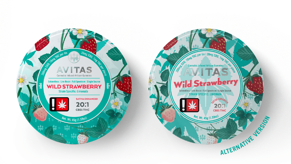
Early label alternatives — variations in type scale and information hierarchy.
03 / The hummingbird exploration
Exploring a new symbol.
The client then requested a move away from turquoise and suggested a hummingbird to express an Oregon connection. I developed a textured bird illustration and incorporated it into a richer blackberry-and-blossom composition, exploring another way to bring the regional story into the packaging.

Illustration development — the hummingbird explored for the botanical packaging direction.
04 / The labeling constraint
Making room for changing data.
The packaging needed a dedicated label area for variable testing data and Oregon-required information. I integrated a horizontal band into the composition, balancing those practical needs with the illustration and brand hierarchy. The comparison shows how the label changed the available space on the tin.

Concept comparison — the Midnight Blackberries tin before and after the information band is applied.
05 / The final design direction
Letting the fruit lead.
Following client feedback, I simplified the dense botanical treatment into larger fruit illustrations against open fields of color. Hood River Cherry Lime, Rogue Valley Pear, and Willamette Blackberry connect the flavors to Oregon places. A shared layout and distinct colors bring the three tins together while preserving each flavor’s identity.

Final design rendering — Hood River Cherry Lime.

Final design rendering — Rogue Valley Pear.

Final design rendering — Willamette Blackberry.
06 / Into production · 2022
From exploration to production.
The final design went into production in 2022. Across the revisions, I adapted the illustration, palette, and packaging layout to changing client requests while retaining the handmade character of the original brief. The resulting family combines a consistent flavor hierarchy with space for variable testing data and required labeling.

Packaging family rendering — the final direction taken into production in 2022.